
Trading
Outside of work I trade index futures 📈. Like most people I started on TradingView, and when it didn't show me what I wanted I started writing my own Pine indicators for it, such as HTF Vertical Lines, which draws higher timeframe boundaries onto a lower timeframe chart.
That got me part of the way, but I kept running into the same wall: a charting platform shows you everything at once and waits for you to notice things. I wanted the opposite, something that stays quiet until the market does something worth reacting to, running on my own data rather than a vendor terminal. So I built two tools of my own 🔧. This dashboard is the one I watch while the session is running; the other is a chart screener for working through a watchlist outside of it.
One screen, three timeframes
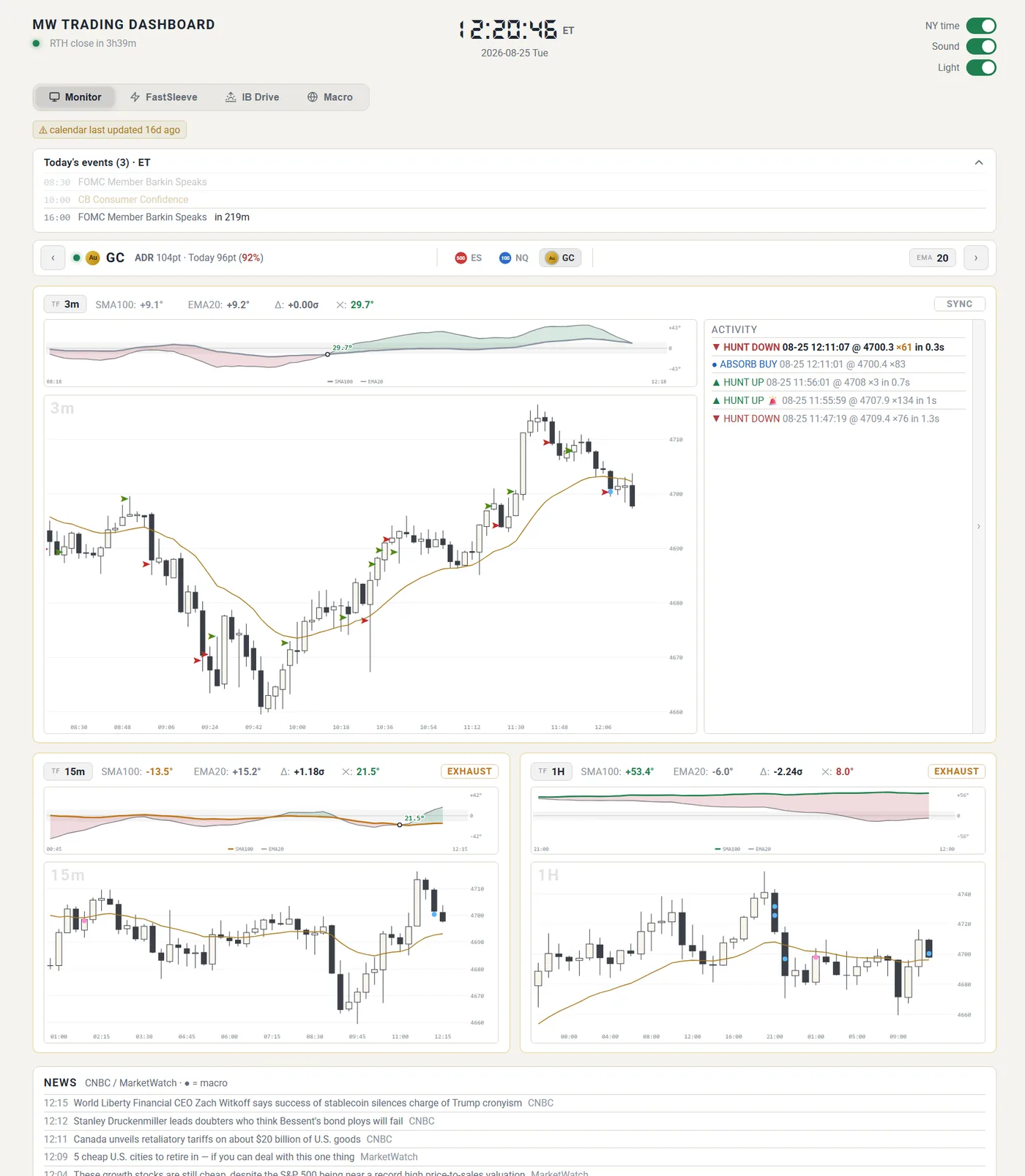
The main view stacks 3m, 15m, and 1H charts for whichever instrument I'm following, with one click to switch between ES, NQ, and gold. Above each chart sits a slope panel that plots the angle of the fast and slow moving averages against each other. The gap between the two lines is what I actually read: a widening funnel means the trend is picking up, a narrowing one means it's being flattened out. Each card is tagged automatically as exhaust, fading, or sync, so I can tell at a glance whether the timeframes agree and whether a move still has legs. The header also tracks how much of the average daily range is already spent, which is usually the fastest way to know I'm late.
Click to enlarge
It tells me when something happens
The activity feed on the right logs unusual volume bursts as they land, with the direction, price, size, and how fast it printed. A hunt is aggressive volume pushing through, an absorb is size sitting on the bid or offer soaking it up, and the two mean very different things. Anything large enough triggers a sound alert 🔔, so I can leave the screen and still catch the moment something breaks.
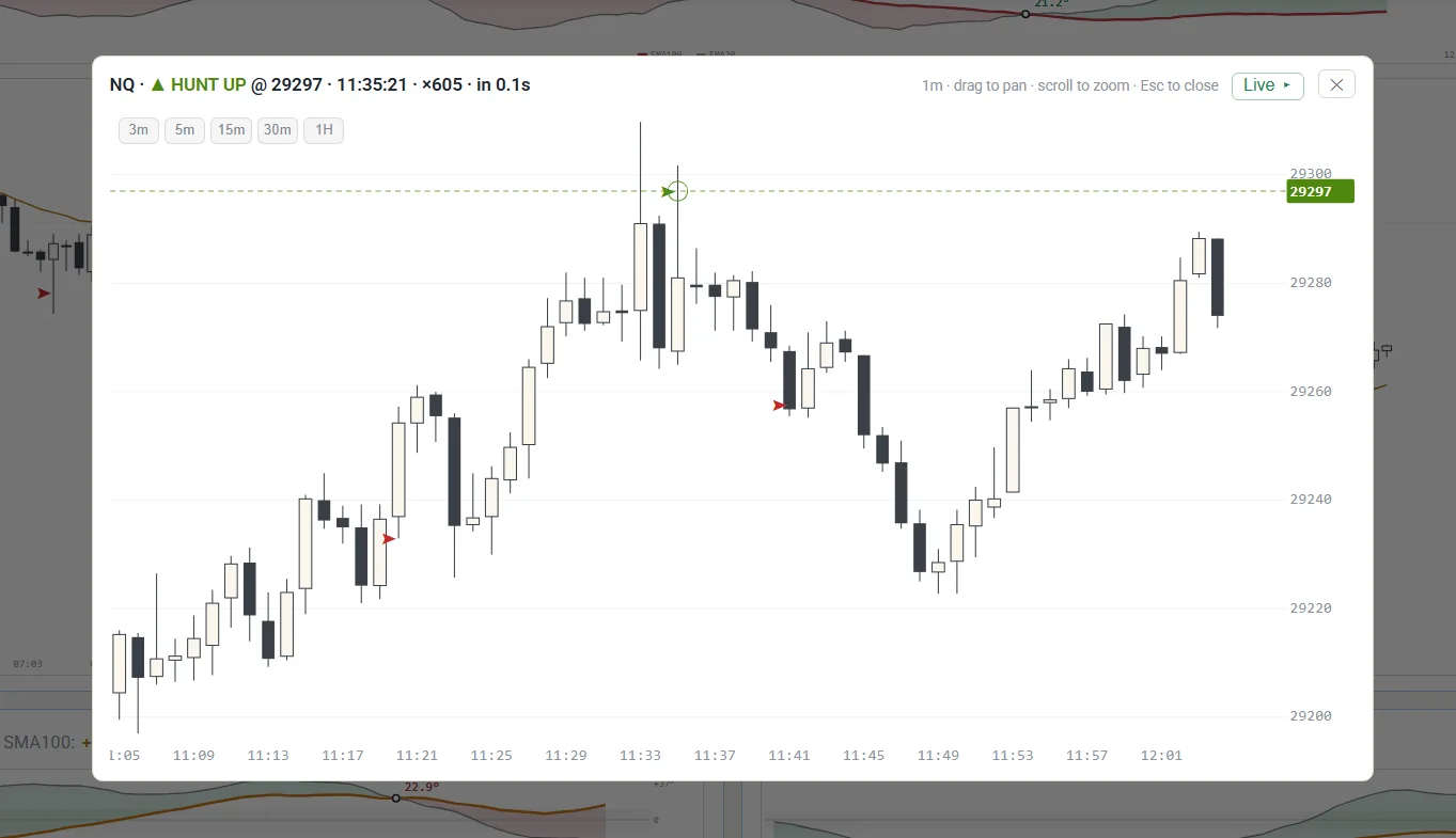
Clicking any entry opens a 1m chart centred on that exact tick, marked with the price it printed at. From there I can pan, zoom, or step up through 3m to 1H to see how the move sat inside the bigger picture, then hit Live to drop back to the current session. It means I can read the context of a print without leaving the dashboard or reaching for another tool.
Click to enlarge
Context around the charts
Price alone isn't enough, so the dashboard also tracks the things that move it. The top bar carries a session clock with a lamp for the current phase 🚦, green for regular hours, orange for overnight, grey for closed. Below it sits the day's economic calendar, with high impact releases flagged and a blackout warning before the ones I shouldn't be trading through. A separate macro tab tracks positioning, rate expectations, and the levels I'm watching across the wider market, and a news strip pulls in headlines as they break.
Readable on a phone
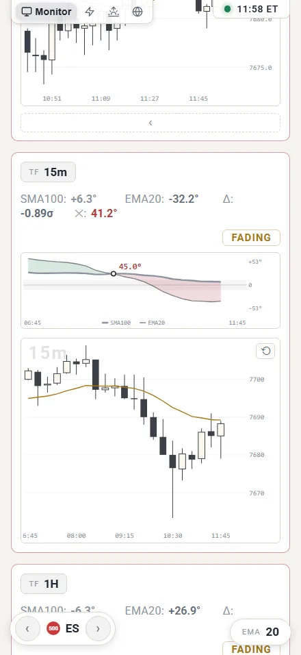
The layout collapses to a single column on a small screen, keeping the tab bar and instrument switcher pinned so I can flick between ES, NQ, and gold with a thumb 📱. Same data, same alerts, just stacked. There's also a light theme, which is the one this site borrowed its colours from ☕.
Click to enlarge
How it's built
Python on the backend for the data feed, alerting, and the analysis passes, with the frontend served as plain HTML, CSS, and JavaScript. No framework and no build step, which keeps it fast to change when I want to try a new idea. Updates stream to the browser over server-sent events, so the charts stay live without polling.